Announcing CRAN/E 2.0
A modernized search platform for the R community
Fresh Coat
We've introduced a new dark and light mode that lets users choose their preferred viewing experience. The color palette, powered by Radix colors, ensures a consistent and accessible experience across the board. Typography has been enhanced by using system fonts, providing a clean, native feel that adapts seamlessly to your device. The layout has also been revamped for improved readability and responsiveness, ensuring the content looks great across all devices.
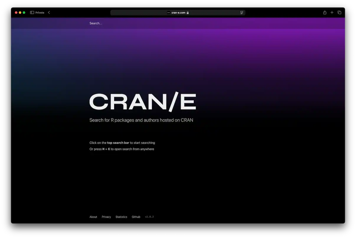
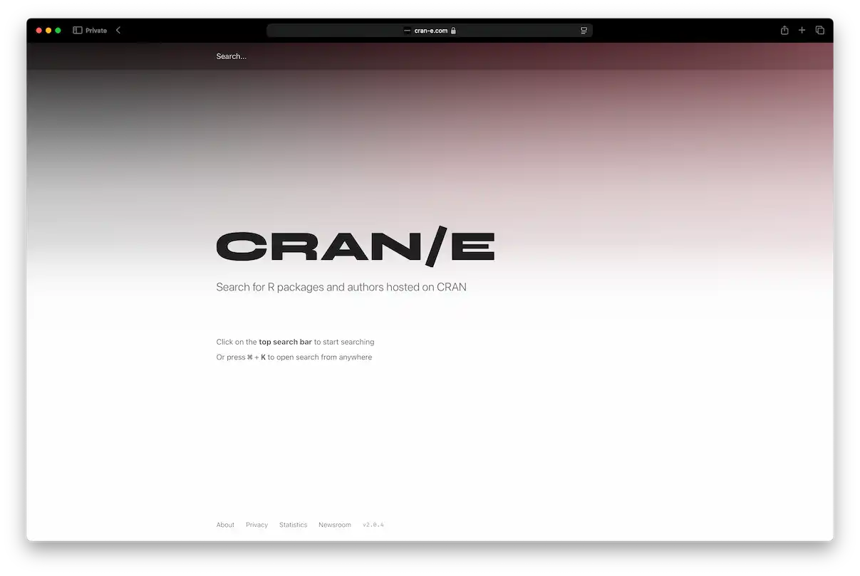
Additionally, we've optimized contrast levels in both modes to reduce eye strain, making long sessions more comfortable for users. The new design takes into account feedback from our user community, ensuring that accessibility standards are met, and that the user interface remains intuitive and straightforward. Our goal was not just to modernize the look but also to make sure the experience is inclusive for everyone, from newcomers to seasoned users.
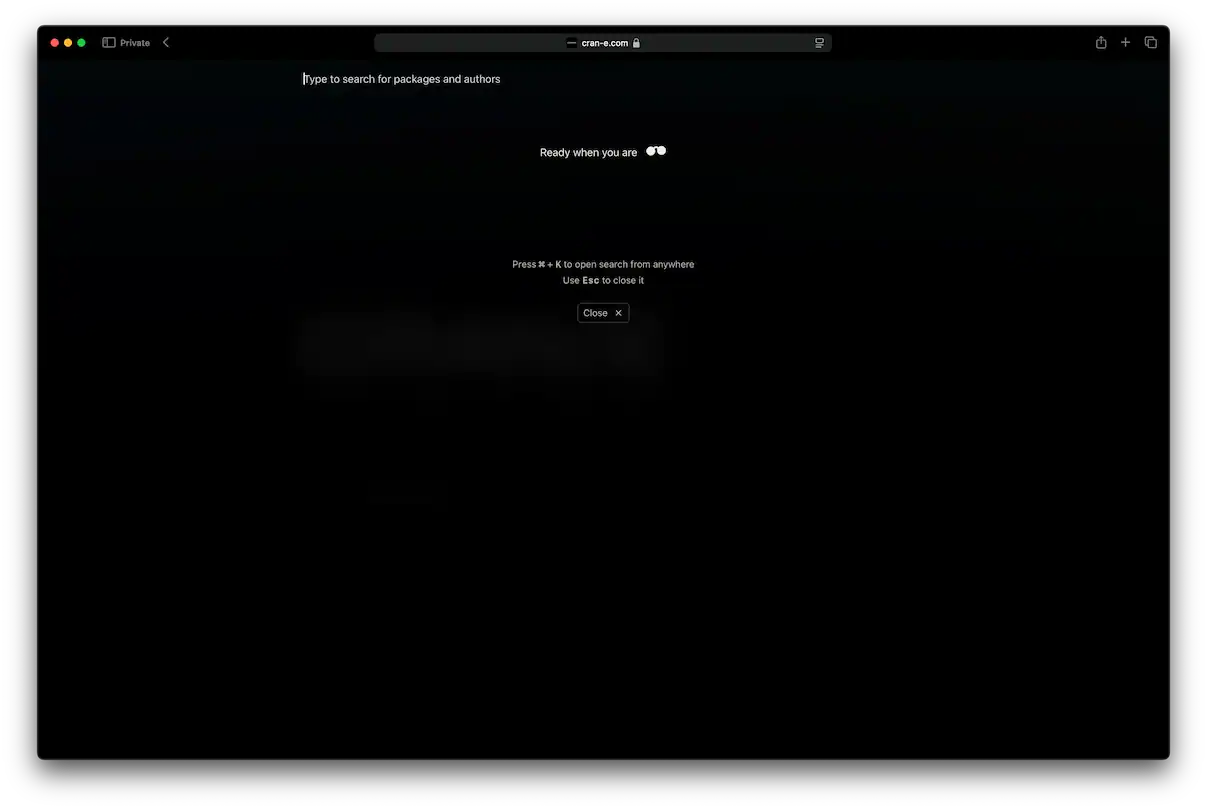
Compact Design
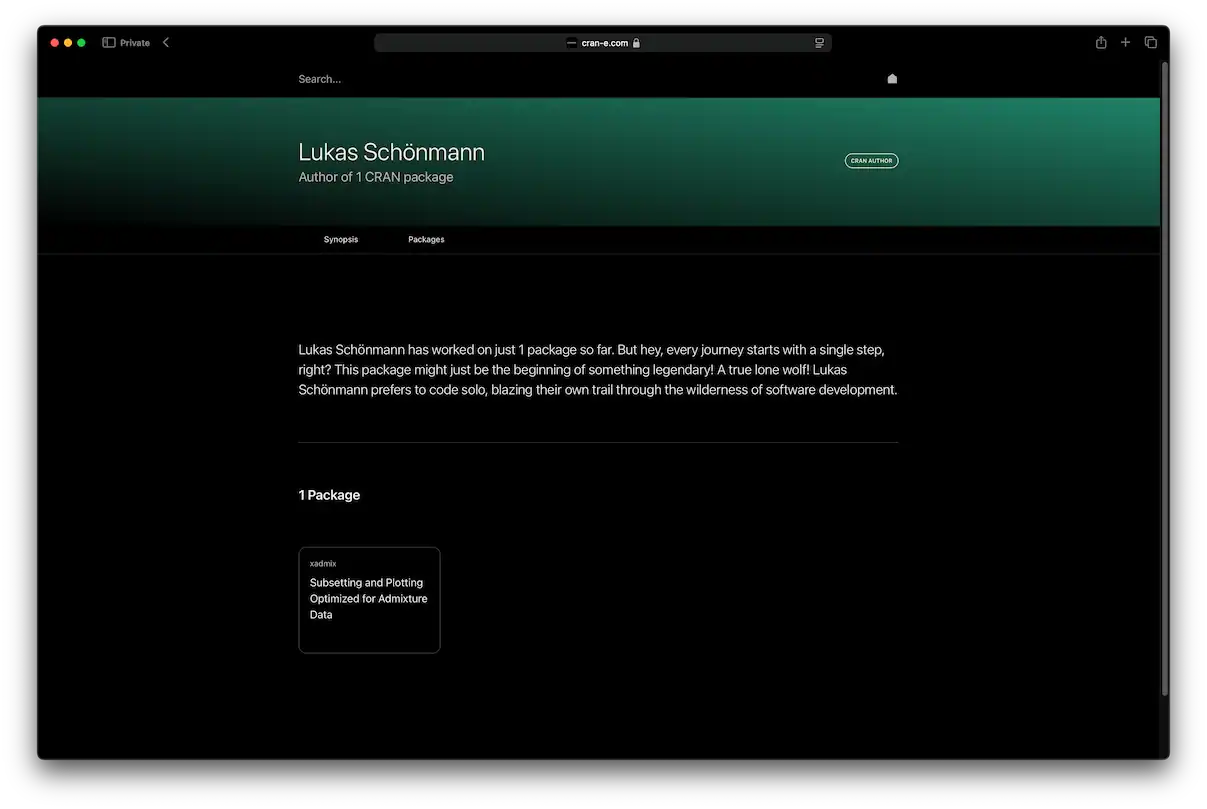
One of our primary goals for this update was a more compact, efficient design. We've significantly reduced white space, allowing for much more information to be visible on each screen, especially for package detail pages. Despite the denser layout, we've ensured the interface remains easy to read and navigate, with a decluttered, streamlined look. By adopting system fonts, we've also made the site feel more familiar and native, laying a strong foundation for the years ahead.
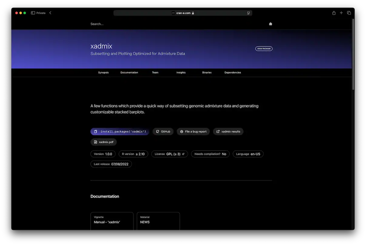
The new compact design enhances productivity by presenting data more effectively without overwhelming users. We've implemented a card-based layout for key sections, which allows for quick scanning and easier content discovery. Package details are now grouped logically to facilitate faster access to critical information. Users can now quickly navigate through packages, dependencies, and release notes—all within a more unified and fluid experience.
New Framework
The transition from version 1 to version 2 also involved a major framework upgrade. We moved from SvelteKit to Remix, as SvelteKit, while functional, felt more akin to a templating engine rather than a comprehensive solution for our evolving needs. Remix, on the other hand, provides a robust, full-featured framework that simplifies the creation of more complex applications. CRAN/E remains a Progressive Web App (PWA) and continues to be fully Open Source, embracing the principles of transparency and community-driven development.
This new framework allows us to leverage advanced routing capabilities, enhancing the speed and performance of the site. Remix's built-in support for nested routes and optimized data fetching has enabled us to streamline interactions, significantly reducing load times and improving user experience. By choosing Remix, we are also better equipped to handle future scalability, ensuring that CRAN/E can grow alongside the expanding needs of the community.
Closing Words
The release of CRAN/E 2.0 marks a significant milestone in our journey to provide a modern, efficient, and user-friendly platform for the R community. We've listened to your feedback and incorporated changes that not only improve the look and feel of the site but also enhance its functionality and accessibility. With a fresh design, a compact interface, and a new framework powering the experience, we believe CRAN/E is now better equipped to serve both current and future users.
We are excited about the road ahead and are committed to continuously improving CRAN/E based on the needs of our vibrant community. As always, we welcome your thoughts, suggestions, and contributions. Together, we can ensure that CRAN/E remains a valuable resource for R developers, researchers, and enthusiasts worldwide. Thank you for being part of this journey.